Professional Design FOR your Letterhead
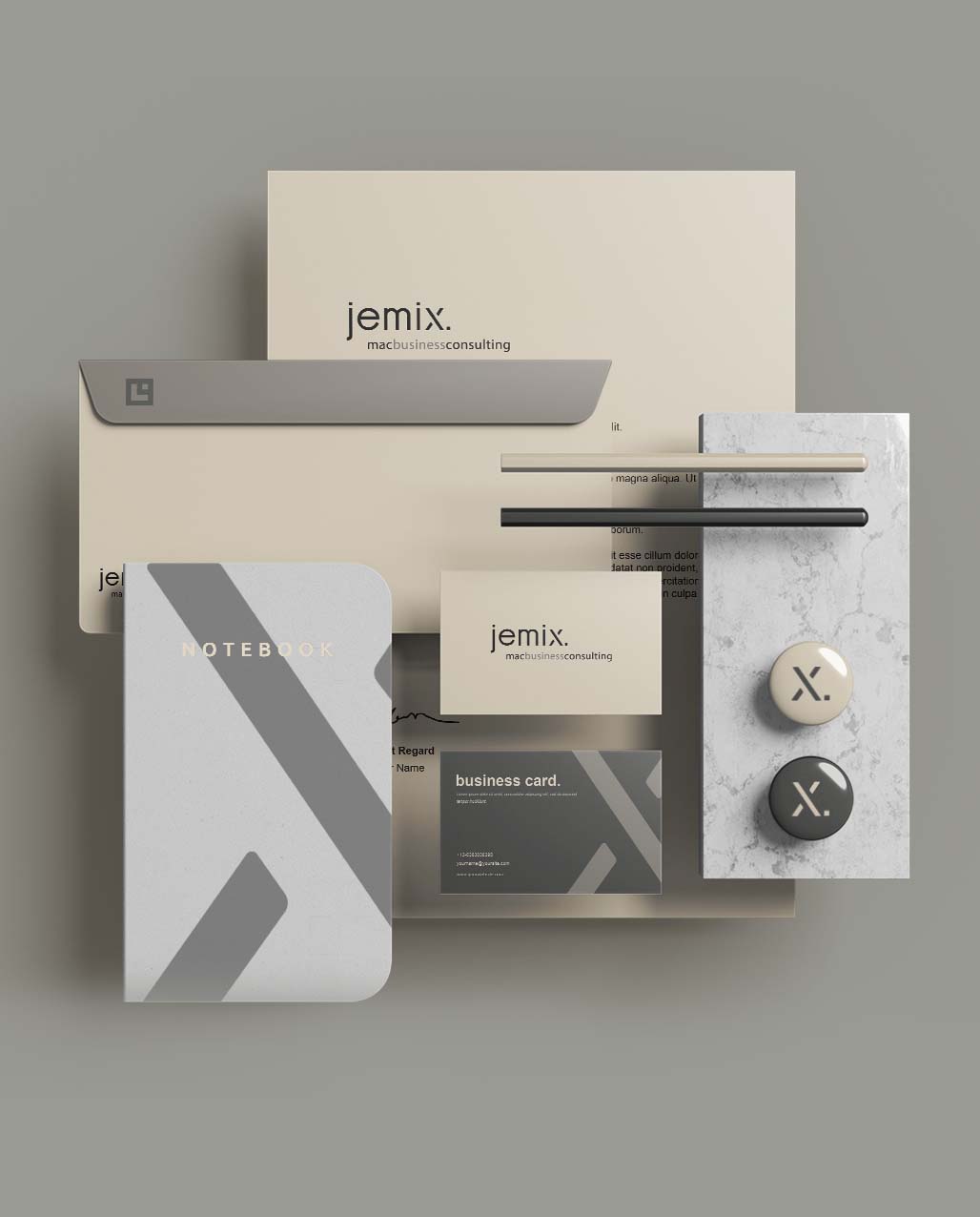
Just imagine that you can communicate digitally with interested parties and customers using your own professional digital stationary and design. With MacNulis you are only one click away from strenghten your digital correspondence with a unique professional digital letterhead.
Strengthen your position in a competitive market by being recognized; because you always have the right design.
Corporate Identity /
Corporate Design
Digitalization and globalization created an enormous dynamic business field with high competition. That is why it is more important than ever to implement a professional communication strategy to stand out among the competitors. An integral part is corporate identity. While the corporate identity describes the overall internal and external image of your company, corporate design dictates the visual appearance of your company through all communication channels: flyers, posters, business booklet, business cards, letterhead, and more. Corporate design is the foundation of a unique and consistent appearance and defines the principles how to design all required office equipment and documents.
In contrast to business cards the letterhead must follow certain requirements in the external communication. These requirements also apply to all kinds of flyers, booklets and catalogues. In addition, a DIN standard should be followed when creating stationary. The standard DIN 5008 is not legally required, however it consists of a number of recommendations for the layout which are generally accepted.


The business letter according
to DIN5008
The Deutsches Institut für Normung e. V., or DIN for short, has set itself the task (in consensus with experts) of establishing standards for the quality assurance of services, processes or products called the “DIN standards”. In order to be always up-to-date a DIN standard is reviewed at the latest every five years and revised if necessary. The DIN standard is only a recommendation, i.e. the DIN 5008 standards for business correspondence are not legal requirements. Nevertheless, it is worth looking at the design and layout suggestions. A complete disregard is not advisable if for no other reason than simply because a business letter DIN 5008 format is experienced as reader-friendly and clear. With the latest revision (in 2011) DIN 5008 recommends for business letters a 4.5 cm margin from the top edge of the paper, a 2.5 cm margin from the left edge and 2.0 cm margin from the right edge. For good legibility the text should be written with at least the font size of 10. For the address located in the top left a maximum of nine lines is suggested, plus one additional line for the return address. Whereas in the past the subject was usually preceded by an introduction this has now been dispensed with. A “subject” is nowadays considered old fashioned. DIN recommends two blank lines between the subject and address field. In contrast to the previous version, the new DIN 5008 supports the international order of year-month-day (for example 2016-12-09) for the date and addresses questions relating to the correct salutation, suitable greetings and the correct annotation for attachments.

The right letterhead design
While DIN 5008 may be a recommendation, this does not true of mandatory information required by law. This mandatory information is obligatory for every commercially registered company and must be taken into account when designing your stationery.
If the mandatory information is missing, you risk being denounced by competitors and authorities can demand penalty payments of up to 5,000 euros.
The way or form in which you provide the mandatory information is not regulated by law. Here you can work as a company or with a commissioned designer to make the information conform to the corporate design.


Your own individual
stationery design
A letter is divided into a header, the main text, and the footer. A distinctive business letterhead should contain the logo. The correct position for this is the free space above the address field, i.e. above the header. The logo can be left-aligned, centered or right-aligned. In order to communicate the size and success of a company, further offices, branches or subsidiaries can be listed. Whether these are clearly visible and prominently placed on the right-hand edge or more subtly at the end of the letter with the bank information etc. must be decided in the overall context. Both the corporate identity and the competitive environment provide good indicators. Separation lines, vertical or horizontal, are additional possible design elements. If your corporate design provides a special typography and/or corporate color/typeface, these should be used for quick recognition in all texts.

Legal requirements
Mandatory information such as the name and location of the registration office, the registered number as well as the full name of the managing director(s) or the liable partner(s) should always be at the end of the letter. Mandatory information for invoices such as bank details, including IBAN and BIC as well as the VAT identification number should also be included. The layout can be divided into two or more columns or as an enumerated text, right-justified, left-justified or centrally formatted, with or without enumeration marks.
The layout in the footer area should contribute to an overall unified impression of your stationery. Too many different fonts, sizes and changing formatting principles of individual letter elements create unease and make legibility difficult. A letter quickly appears “untidy” and causes the opposite of creating trust and inducing sympathy. Since letters are also sometimes still sent by fax, stationery should also be usable in black and white.
In a typical company, once the layout and design of the stationery has been determined and approved, the template is usually saved as a PDF file for further use. The file format of a PDF, however, is incompatible with Word, as well as with all other common word processing and calculation programs. In everyday office life the text is therefore often printed on (expensive) company stationery first, then digitized again as a scan so that it can then be sent by e-mail. This is a cumbersome and expensive process for letters that were originally no longer intended to be sent by mail for reasons of efficiency. MacNulis shortens the process and thus saves costs, time and the environment. In just three steps MacNulis transforms the PDF of your letterhead design template into a digital stamp with which you can turn any of your texts, tables and presentations into a digital document with your individual letterhead design with just one click.


